Flash free online hotspot editor for AJAX-ZOOM 3D/360/2D player. With the help of this editor you can create multiple hotspots or rectangle image areas and setup several click / mouseover actions for them e.g. links, tooltips, popup lightboxes or bind your own JavaScript functions including AJAX-ZOOM API for several events. The default example is a 360 degrees image set. You can however load any other images like catalogue pages or photo albums and create hotspots on single (2D) images as well.
As a result the hotspot editor returns a JSON object with all settings including the positions of the hotspots and / or rectangle image areas. Among other considerable possibilities this JSON object can be saved to a JavaScript file and loaded into any other AJAX-ZOOM example later.
jQuery.fn.axZm.loadHotspotsFromJsFile('../pic/hotspotJS/eos_1100D.js');
If you will use a database you can just change the first few lines in this file
to load and POST the JSON. All variables are explained inline.
You can even parse this file as a template... There is no need to change
anything in this file except the upper part with few variables in order to
implement it in any CMS.
This file (example33.php) is the actual hotspots editor. With the help of this editor you can define and edit the hotspots. It is supposed to be in some restricted area of your page. For showing the results and integration of the player into your frontend please use one of the following "clean" examples as the starting point. Also please be aware of that AJAX-ZOOM is highly configurable so you can change the look and feel of nearly everything you could think of.
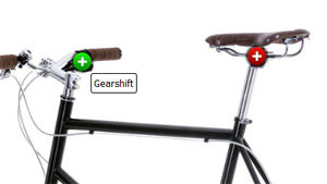 example33_clean.php basically it has the same setup as this editor but without the toolbar under the player.
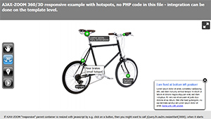 For responsive integrations please use example33_responsive.php
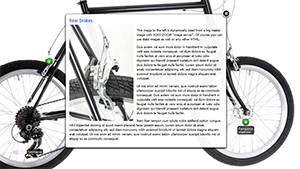 Fullscreen example33_fullscreen.php
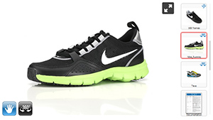 Gallery with mixed content - still images, videos from diverse sources like
Youtube/Vimeo/Dailymotion, documents and 360/3D with or without hotspots.
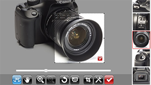 Sometimes you would want not to put visible hotspots on a spin but only spin to a certain frame and zoom to the area you want to show.
In this case we suggest you to take a look at example35.php which is also the main editor for this; there you will find links to
"clean" and responsive implementations.
With this tool you can easily create several crops / thumbnails from 2D images / galleries,
360 spins or 3D multirow which are loaded into AJAX-ZOOM player.
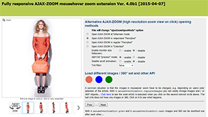 The basis for ecommerce modules / plugins is mainly
example32_responsive.php.
It does already support hotspots over options settings.
This editor will be certainly, maybe already is (please check), integrated into our modules for
Magento,
PrestaShop,
Opencart,
WooCommerce,
Shopware
and other plugins.
AJAX-ZOOM offers an extended API to handle hotspots in various ways. In fact the entire hotspot editor is built upon this API. The result of the hotspot configurator is a static configuration saved in a file. However you can also build applications which will set hotspots dynamically depending e.g. on users choice.
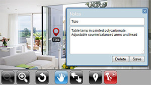 Tutorial for developers of how to add "tags" to the images and let the users add title and description.
This is a little different version of the hotspot editor which is kept simple and is focused only on couple
AJAX-ZOOM hotspot features. The example is not completed in the sense that it is meant for developers who can complete and
adjust for their own needs.
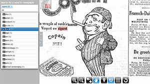 example34 shows an application, where hotspots are
created dynamically and highlight choosen words in the text (saved as image).
If you would like AJAX-ZOOM team to build an application for you, please get in touch with us.
The only difference between any other AJAX-ZOOM implementation / example is that the JavaScript file with JSON data produced by this editor is loaded in AJAX-ZOOM onLoad callback with jQuery.fn.axZm.loadHotspotsFromJsFile API, see below... Once again, do not try to adapt this editor (example33.php) for final view. You can use other example33_x examples or basically any other example for this.
Please note that depending on configured hotspots functionality other plugins like Fancybox might be needed!
<!-- jQuery core -->
<script type="text/javascript" src="https://ajax.googleapis.com/ajax/libs/jquery/1.8.3/jquery.min.js"></script>

<!-- AJAX-ZOOM core, needed! -->
<link href="../axZm/axZm.css" type="text/css" rel="stylesheet" />
<script type="text/javascript" src="../axZm/jquery.axZm.js"></script>
<div style="min-width: 100px;">
	<div id="abc">
		<!-- Content inside target will be removed -->
		<div style="padding: 20px">Loading, please wait...</div>
	</div>
</div>
// Create empty object
var ajaxZoom = {};

// Define callbacks, for complete list check the docs
ajaxZoom.opt = {
	onBeforeStart: function(){
		// Set backgrounf color, can also be done in css file
		jQuery(".axZm_zoomContainer").css({backgroundColor: "#FFFFFF"});
	},
	onLoad: function(){
		// Some settings can be set inline
		jQuery.axZm.spinReverse = false;

		// Load hotspots over this function...
		// or just define jQuery.axZm.hotspots here and trigger jQuery.fn.axZm.initHotspots();
		jQuery.fn.axZm.loadHotspotsFromJsFile("../pic/hotspotJS/eos_1100D.js", false, function(){
			// Do something after hotspots are loaded
		});
	}
};

// Define the path to the axZm folder, adjust the path if needed!
ajaxZoom.path = "../axZm/";

// Define your custom parameter query string
// example=spinIpad has many presets for 360 images
// You can change them in /axZm/zoomConfig.inc.php after elseif ($_GET['example'] == 'spinIpad')
// 3dDir - best absolute path to the folder with 360/3D images
// for 2D you can use zoomData, e.g. zoomData=/your/path/image1.jpg|/your/otherPath/image2.jpg
ajaxZoom.parameter = "example=spinIpad&3dDir=/pic/zoom3d/Uvex_Occhiali";

// The ID of the element where ajax-zoom has to be inserted into
ajaxZoom.divID = "abc";

// Fire AJAX-ZOOM
jQuery.fn.axZm.load({
	opt: ajaxZoom.opt,
	path: ajaxZoom.path,
	parameter: ajaxZoom.parameter,
	divID: ajaxZoom.divID
});
These options below are only about possible hotspot settings and not the AJAX-ZOOM player itself. AJAX-ZOOM player can be configured with hundreds of other options to suit anybody's needs. See AJAX-ZOOM documentation and other examples.
axZmToolTipTitleCustom (try it)
axZmToolTipInnerCustom (try it)
axZmHotspotLabelFlat,
default is axZmHotspotLabel
axZmHotspotTextCustom (try it)
{"color":"black","height":"100%","width":"100%"}
jQuery.fancybox(
	[{
		'href': '/path/some/image1.jpg',
		'title': 'Description 1 image'
	},{
		'href': '/path/other/image2.jpg',
		'title': 'Description 2 image'
	}], {
	'padding': 0,
	'transitionIn': 'none',
	'transitionOut': 'none',
	'type': 'image',
	'titlePosition': 'over',
	'changeFade': 0
});
/pic/zoom/animals/test_animals1.png"/pic/zoom/animals/test_animals1.png|/pic/zoom/animals/test_animals2.png"/pic/zoom/animals"
/pic/zoom3d/Uvex_Occhiali";
/pic/zoomVR/nike" /pic/hotspotJS/eos_1100D.js"When you hit the "LOAD" button the parameters entered are passed to the function "changeAxZmContentPHP" located in "/axZm/extensions/jquery.axZm.hotspotEditor.js", which basically just reloads the player same way it is loaded when the page is opened.
There are also different ways of loading and saving hotspot configuration parameters besides loading a static JavaScript file. For example you could point to /some/dyn_language/file.do?hotspotID=123 which would return the JSON object stored in a database. If you use the API function jQuery.fn.axZm.loadHotspotsFromJsFile then you have to reference jQuery.axZm.hotspots variable to the returned JSON object from your /some/dyn_language/file.do (the return of this file is expected to be JavaScript - without script tags).
Alternatively define jQuery.axZm.hotspots wherever after AJAX-ZOOM is initialized, e.g. onBeforeStart callback (or later at any time) and "manually" init the hotspots with jQuery.fn.initHotspots()
Taking the above one step farther you can also build applications which will set hotspots dynamically depending e.g. on users choice or action. example34 shows such an application, where hotspots are created dynamically and highlight choosen words in the text (saved as image).